How to Match Your Paver Color to Your Siding
The Hardscape Autopsy: Why Color Choice Fails at the Base
I recently got called out to tear up a $30,000 patio that was sinking because the previous contractor failed to account for the hydrostatic pressure and sub-base compaction. But even before we hit the dirt, the client was miserable. Why? Because the expensive pavers they chose looked like a bruised thumb against their siding. They had picked a cool, blue-toned slate for a house with warm, cream-colored vinyl. It was a visual train wreck. If you do not match the thermal and visual weight of your stone to the vertical structure of the home, you are just throwing money into a hole. Landscaping is civil engineering with an aesthetic requirement. Don’t skip the planning. It matters. Every single inch of that base must be level, but if the color is off, the leveling won’t save your pride.
How to match your paver color to your siding?
To match your paver color to your siding, you must identify the primary undertone of your home’s exterior—either warm, cool, or neutral—and select a paver palette that either provides a complementary contrast or a monochromatic match based on the 60-30-10 design rule for outdoor hardscaping.
The Engineering of Exterior Aesthetics
When we talk about pavers, we are talking about concrete or natural stone units designed to withstand 8,000 PSI or more. But the human eye does not see PSI; it sees light reflection. The pigments in concrete pavers are typically iron oxide based. These pigments react to UV exposure over time. A paver that looks perfect in the showroom might look like chalk in three years if the manufacturer used cheap surface-only dyes rather than integral color. You need to look at the cross-section of the paver. If the color does not go all the way through, walk away. It is garbage. We use a concept called Color Temperature Harmony. If your siding is a cool gray, a warm red brick paver will create a high-contrast vibrating edge that is exhausting to look at. Stick to the same side of the color wheel unless you are a master designer. Most homeowners should aim for two shades darker than their siding. This grounds the house. It gives it a foundation. Anything lighter than the house makes the structure look top-heavy and unstable. It is basic architectural physics.
“A retaining wall doesn’t fail because of the stone; it fails because of the water trapped behind it.” – Hardscape Engineering Axiom
The Material Matrix for Siding and Stone
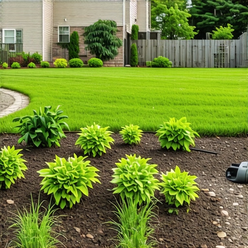
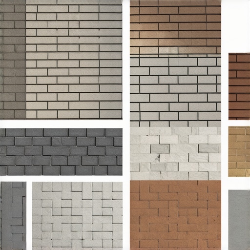
Different siding materials have different textures. Vinyl is smooth and reflective. HardiePlank has a wood-grain texture. Brick is porous and matte. You have to match the texture of the stone to the texture of the siding. A rough-hewn, tumbled paver looks ridiculous next to modern, slick metal siding. It is a mismatch of eras. Use the table below to guide your initial selection process.
| Siding Material | Recommended Paver Tone | Recommended Texture | Avoid These |
|---|---|---|---|
| White Vinyl/Wood | Dark Grays, Charcoal, Slate | Smooth or Chamfered | Cream, Beige (Looks dirty) |
| Red Brick | Earth Tones, Buff, Tan, Brown | Tumbled, Aged, Weathered | Red (Clashes with the brick) |
| Tan/Beige Siding | Deep Browns, Mocha, Teracotta | Natural Cleft, Textured | Light Gray (Cold and sterile) |
| Gray Siding | Blue-Gray, Charcoal, Granite | Modern, Sharp Edges | Yellow-Beige (Sickly appearance) |
The Three-Color Rule in Garden Design
We use a 60-30-10 ratio. 60 percent of your visual field should be the dominant color (the siding). 30 percent is the secondary color (the pavers). 10 percent is the accent (borders, soldier courses, or planting beds). If you introduce a fourth color, the human brain perceives it as clutter. I see this all the time with DIY jobs. They buy a pallet of red, a pallet of gray, and a pallet of tan because they were on sale. It looks like a patchwork quilt from a nightmare. Don’t do it. Pick one primary paver color. Use a darker border to frame the space. This is how you signal to the eye where the living space begins and ends. It is about boundaries. Landscaping is the art of defining space. Use your borders wisely. A dark charcoal border on a light gray patio is a classic for a reason. It works.
“Soil pH and nutrient availability are secondary to structural integrity when designing permanent outdoor living spaces.” – Penn State Agricultural Extension
What color pavers go with a gray house?
For a gray house, choose charcoal, slate, or light silver pavers to create a sophisticated monochromatic look. If you want contrast, use a deep tan or copper-toned stone to provide warmth, but ensure the stone has a gray aggregate mixed in to tie the two elements together visually.
Should pavers be darker or lighter than the house?
As a rule of thumb, pavers should be two shades darker than the siding of the house. This provides a visual anchor for the property. Choosing pavers that are lighter than the house often results in a washed-out appearance and makes the house look disproportionately heavy and poorly grounded.
The Checklist for Color Selection
- Check the Sample Wet: Stone changes color when saturated. If you live in a rainy climate, the wet color is your real color.
- View at 4 PM: This is when the sun is low and the shadows are long. If the color looks good then, it will look good all day.
- Match the Trim: Sometimes it is easier to match the pavers to the window trim or the roof shingles rather than the siding itself.
- Check for Efflorescence: Cheap pavers will develop a white powdery film that ruins the color match. Buy high-quality, pre-sealed units.
- The Soldier Course: Always plan for a border in a contrasting shade to hide cutting imperfections.
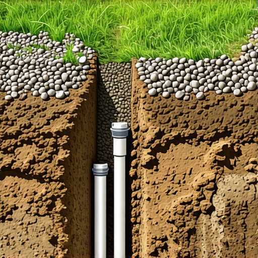
The Science of Sub-Base and Saturation
Color is useless if the patio is a swamp. If you don’t install a proper 6-inch modified gravel base, compacted in 2-inch lifts with a plate compactor, your pavers will shift. When they shift, they trap water. When they trap water, they grow moss and algae. This changes the color from a beautiful gray to a sickly green. This isn’t a design choice; it is a maintenance failure. You need a 1 percent slope away from the foundation. That is one inch of drop for every eight feet of run. This ensures that the water moves. Water is the enemy of hardscaping. It is the universal solvent. It will get into the pores of the concrete, freeze, expand, and pop the surface right off. This is called spalling. It happens to cheap pavers and bad installs. Use polymeric sand in the joints. It hardens like plastic and keeps the weeds out. Weeds are another color-killer. Nothing ruins a tan patio faster than bright green dandelions growing through the cracks. It looks cheap. It looks like a hack did the work. Do it right the first time. Dig deep. Compact hard. Choose your colors with your brain, not just your heart. That is the only way a landscape lasts twenty years instead of two.